Friday, 17 May 2013

placements on placements on placements.

1 comments
It's been 6 months. Whoops.

A lot's been going on. In December I was invited to spend 3 months at The Leith Agency, which was a fantastic opportunity. I worked on some great briefs, had my ideas presented to clients throughout and in the penultimate week got the chance to pitch my concept to a major client myself. I was my own copywriter too, which was an experience. Really learnt a lot and developed an appreciation for crafting words.

Leith opened the door to a placement at Newhaven, which was another fantastic opportunity. Again, great briefs and had ideas presented to clients. Wasn't there as long, but I really enjoyed my time there. 

In turn, Newhaven opened the door to my current stint as art director and designer at The Union. I started this week and it's going well so far. It's open ended, so, we'll see.

I've met with a few potential copywriters over this past month as well. Everything's very up in the air at the moment, not sure what'll land and where but I feel it's all moving in the right direction. That's all you can hope for, really.

Oh, and I moved out. Growing up, innit.

Wednesday, 19 December 2012

#GoHomo

0 comments
As a creative grad, I naturally filled out countless copy tests/applications that featured pretty oddball questions. One of which asked to create a campaign to convince a straight person to be gay.

Challenge accepted.

I created #GoHomo, a campaign that focuses on the advantages of same-sex relationships over mixed, spun toward promoting respect - and a degree of desirability - for gay and lesbian people on behalf of the charity Stonewall. Taking inspiration from the popular slang term "no homo" (meaning "not in a gay way"), #GoHomo is a positive declaration of what people would "go gay for".

By cheekily uniting genders in a battle of the sexes, the campaign calls for people to Tweet their responses of what they would #GoHomo for - whether it be the drawbacks of the opposite sex or the benefits of same sex. The approach unifies gay and straight men as well as lesbian and straight women (typically the pairings which can clash) rather than further alienating sexualities by highlighting differences.


Monday, 23 July 2012

a first, an end and the future.

0 comments
A lot has happened since I last updated this.

Primarily, uni has now finished. It was a sprint to the finish line, bringing prolonged stress and ended with back to back all-nighters. I didn't manage to finish everything, but my expectations within the limits probably weren't all too realistic. Before handing in coursework, we had to prepare and mount our degree show as part of assessment...which brought it's own trials and tribulations.

All the hard work paid off though as I graduated with first class honours. A relief to say the least, and an incredible feeling to achieve what I set out for from the beginning.

Degree show and D&AD's New Blood exhibition in London followed. The former was somewhat of an anti-climax, probably because of the collective exhaustion post hand-in. Didn't particularly like my space in the end either. Some brilliant work was exhibited though and I think Communication Design really pulled it out the bag. It certainly seemed to be the visitor favourite.

The latter began a matter of days after the degree show ended - no rest for the wicked - and a group of 19 of us made our way down. I have mixed feelings about my experience of New Blood. I think it's a useful event with brilliant opportunities, however you can't escape the university favouritism/snobbery. It quickly became a running joke (thinly veiling frustration) when we saw visitors look at our university label and move on without really acknowledging any of the work. It was also a harsh reminder of how much time, effort and money universities put into the stands, all with experienced guidance from tutors. We, unfortunately, had the funding cut and tutors with, er, limited investment. Underdogs we may have been, but we pulled it off and quite a few of us were approached. Didn't help that I had a bad case of the flu in the latter days of the trip which knocked me out of the game. Typical. Although, great times had with the course mates and some agency offers acted as a thick silver lining.

Graduation took place last week and it was a somewhat surreal experience. That was the definitive end to an era, but didn't feel like a goodbye. Silly hats and gowns distracted the emotions, I guess. Too concerned about falling over on stage for reality to kick in. My three remaining grandparents attended the ceremony as my parents couldn't be there (one deceased, one...holidaying) and a nice day was had.

So that's that. The line has been drawn under university and I'm sorting out my next move(s). Currently back at BMB in London for a few weeks, and beyond that - who knows. Playing it by ear.

Still updating my website with work from this year, but most of it is up:


Over and out.

Sunday, 6 May 2012

the fear.

0 comments
Just less than a month to go before everything has to be finished, handed in, degree show set up and uni is over. Expletive. Whilst I would definitely say the pressure has been on these past few weeks, I don't think "THE FEAR" will kick in until I walk into the first year hall, the venue of our degree show and the last hurdle. Or maybe it'll be tomorrow with a meeting that'll run through the protocol of the coming weeks.

Anyway, enough of that. One of my recent projects was a Levi's campaign. It kind of split itself into two directions; one a typographic experiment using the lasercutter and denim, the other a more commercial translation. This is one of the results:


Originally intended to be a clean, bright design etched into denim, it developed into a grungy, worn piece of typography which I actually think fits the context better. It looks 'lived out', achieved by distressing the  lasercut surface of the text.

Tuesday, 3 April 2012

stop motion animations.

1 comments
Ok, so I thought I'd take a wee trip down memory lane and post some animation work I've done over the past few years at university that don't get to see the light of day on my website.

First up is an interpretation of Baz Luhrman's "Everybody's Free To Wear Sunscreen" film, adapted from Mary Schmich's essay of the same name, created by myself and classmate Amber in our 3rd year (January 2011):


We decided to be ambitious and effectively do triple the required running time and include the entire essay. We used ink and black and white images to form the content, and over 5 rolls of wallpaper to achieve the continuous illustration. Nailing the pace of the visuals to the words was a nightmare, let alone the physicality of making said visuals and trying to keep it as consistent and level as possible. I cringe looking at the mistakes and inconsistencies now, but it was an invaluable learning experience that paid off in the end. Plus, 6,300+ views isn't bad.

This was my first experience with stop-motion animation, made in 2nd year (March 2010):


The brief was to visualise our given 30 second audio clip. I got Tchaikovsky's "Chinese Dance" from The Nutcracker. To me it sounded like tiptoeing, which conjured up a narrative of sneaking back home after a night out. I wanted to contrast the delicate ballet score with dance beats of nightlife, so opted for Owl City's "Hello Seattle [Remix]". Stylistically, inspired by the song title I looked at Chinese shadow puppet theatre which led to the animation taking place on an light-box with paper and assorted other material creating the scenery, props and characters. "Chinese Dance" is also known as "Tea", so there's a playful reference in the characters tea-leaf vomit. Classy.

Again, filled with cringe at the execution now, but I think it was a successful first attempt all things considered.

Friday, 30 March 2012

YCN heinz salad cream brief.

1 comments
For this (YCN) brief, the challenge was to advertise Heinz Salad Cream to young adults (whilst still appealing to those older and younger), a demographic who may have loved it in childhood but have since distanced themselves in favour of mayonnaise, BBQ sauce and tomato ketchup.

My response was to highlight the versatility of Salad Cream, whilst increasing awareness of the product itself. The outcome is a series of print ads, visualising Heinz Salad Cream as a constant within an equation whilst the foods shown are interchangeable. Whether used as a healthier substitute for mayonnaise, a dipping sauce, sandwich spread or dressing: Heinz Salad Cream is the condiment that can compliment it. The tagline is a spin on Mary Poppin's iconic "A spoonful of sugar helps the medicine go down", which intends to be a light hearted play on the Salad Cream as the "sugar" that can make anything taste better - even, perhaps, the "medicine" of vegetables.

The imagery is slick, fresh, contemporary and vibrant, yet also presents a natural, rustic and homely visual that retains focus on the food itself. It not only connotes summer picnics, barbecues and time spent in the kitchen, but also appeals to those who are more conscious of - and value - a healthier and more natural option.


Saturday, 17 March 2012

d&ad little white lies - black swan.

1 comments
So, one of my 83746783 odd projects this semester was D&AD's illustration brief which challenged us to pick one of Little White Lies' favourite films of 2011 and (re)design a cover for their magazine. This was the result:

It went in several directions, but this was the route I was most happy with. I think I may use one of the other concepts for my minimal movie poster series (well, two posters).

This idea is pretty self explanatory, it's a visualisation of the conflict between light and dark, white and black, reality and fantasy, and innocence and corruption, that are explored throughout the film.

Friday, 10 February 2012

interim show + current/future projects.

1 comments


This week saw Stage 4 Communication Design exhibit our Interim Show, an opportunity for the external examiner to get a glimpse of our work and to speak with us ahead of our final submission and degree show in June (!).

Didn't get much of an opportunity to properly look at everyone's display (it was only up for a few days) but there was some great stuff. I felt it was pulled out of the bag, and Vis/Com shone in particular. Well, naturally.

I chose to display a selection of concept development from my self-initiated brief to create a print media campaign that promotes and strengthens the relationship Orange has with film (through 'Orange Wednesdays' which offers 2-for-1 cinema tickets, 'Film To Go' that provides a free film rental on iTunes every Thursday, and sponsoring the BAFTA's). My solution was an all-encompassing and to-the-point idea: "See Film Through Us". The copy led to exploring various methods of visualising the concept, ranging from literal to more abstract, including experimentation of opacity both digitally and through tactile material.

At the moment the project is evolving into a different and - I think - more effective direction, but is somewhat being put on the back burner for now as D&AD and YCN deadlines loom closer (March!). I've undertaken two briefs from the former; to illustrate a Little White Lies cover for the film Black Swan, and create a 21st century whisky brand for Design Bridge that defies tradition and appeals to the typically elusive international female market. As for YCN, the briefs I've begun working on include; creating a campaign to encourage the young to like Heinz Salad Cream again, another campaign to promote The Independent's 'i' supplement to students, re-design the Graze packaging, and if I have time I'd like to work on a campaign for Feel Good Drinks too.

I have ideas in place for all of the above, it's now simply a case of implementing them. Shall certainly be a challenge, but I like to push myself and I want to get used to more intense, quick turnarounds that'll be standard in industry. March to June isn't going to be any more relaxed either, with the further projects planned (including Levi's and Pretty Polly) in addition to finishing off anything else if required.

Oh, there's also the Creative Star Student Awards which I need to get on with.

All systems go.

Monday, 30 January 2012

auf wiedersehen, dissertation.

1 comments


So, that's that done then. 8318 words and 25% of my degree has now been submitted.

Hasn't quite sunk in that something that elicited so much fear and stress over the years, is not only done, but was relatively painless.

After faffing around for a while, I settled on; "Branding culture: How we claim our identity through commercial media", an exploration of what it means to be a product of our environment in todays culture. I delved into how we individually identify and aspire to obtain/allude ideals through surrounding ourselves with specific brands. I investigated the visual messages presented through; celebrity endorsement (Run-DMC's relationship with Adidas), product placement (Apple and Starbucks omnipresence within media), conventional advertising ("I'm a Mac/I'm a PC") and further brand personification (Betty Crocker and Aunt Jemima), and also explored how commercial media can dictate cultural identity as a whole using Coca-Cola's rebranding of Santa Claus and Christmas as a definitive example (Coke popularised and standardised the image of Santa as a fat, jolly man with a white beard and red coat through their advertising. Beforehand Santa Claus/Father Christmas/St. Nick/Kris Kringle etc. differed between cultures).

What I enjoyed in particular with this topic was the scope of research on the "why?". There's a frustrated sociological psychologist of some sort inside me begging to be free, apparently. Who knew? Whether it be our ongoing "quest for cool", the primitive desire for inclusion/recognition from our "tribes", or social conditioning in the vein of Pavlov's Dog where brands have trained us to salivate on command for their products; it's all interesting.

Now we can draw a line under all that. Got my semester one work back too, so all systems go on the next chapter, I suppose. This one is going to be brutal. The last hurdle.

Tuesday, 27 December 2011

2011 reflection+ 2012 resolution.

0 comments
So, it's 2012 now. That was quick. 2011 has certainly flown by and it's mental to think we're half way through our final degree year already. Not long now.

I'd say that a lot of progress was made in 2011, primarily in the form of industry experience; from the branding work at Hamlin Daniels, to experiencing a large scale advertising agency at BMB, to contributing to next years Edinburgh Fringe Festival campaign at Whitespace. All invaluable, enjoyable and confirmed without a doubt that I'm pursuing the right path. I learnt a lot and met some great people along the way.

University wise, the slightly more naive and relaxed days of 3rd year are but a distant memory. 4th year is overcast with the exciting yet ominous reality of graduating and entering the real world. This semester has been somewhat stop and go with placement interruption, dissertation distraction and an initial project false start, but I have two solid projects approaching completion and a few more on the go, industry experience under my belt and a well received essay draft to show for it. Not as productive as I'd have hoped, but on track.

2012, for me, is full of goals. Thought it might be helpful to write them down.

1. Achieve at least a B on my dissertation. I'd die of shock with an A.

2. As always, aim for a first-class honours. No point in not.

3. Enter as many D&AD and YCN briefs as I can. I think there's about 10 that I have my eye on.

4. Time permitting, I'd like to enter the Penguin Design Awards too.

5. Get a collaborative project on the go.

6. Put on a degree show that I can be proud of.

7. Get more familiar with InDesign.

8. Sort out at least two more work placements. Realistically, I don't think I can afford to lose any more time during semester, so they'll need to take place during summer. I have my eyes set on a few agencies.

9. New Blood. Make the most of it.

10. Be better.

Wednesday, 21 December 2011

dexter + beyond.

15 comments

Over the last week or so I finally got around to watching Dexter. Two seasons down, and yes it's amazing. It reminded me of these posters I was shown earlier this year, created by Ty Mattson. I love them. Slick, original and striking.

Taking it to the next level, the posters were animated into a title sequence for the show with equally great results. I love the minimal, Saul Bass-esque 40s/50s motion graphic approach. The style seen elsewhere in Kuntzel and Deygas's work with Catch Me If You Can, and Pixar's The Incredibles and Monsters Inc, to name but a few.


Wish I had more time this year to explore the ideas inspired by it all. Alas. Will need to wait.


Tuesday, 25 October 2011

october.

0 comments
So, an update.

Began my fourth, and final, year of uni which has brought along more change than I bargained for in the form of a new studio and new tutors. Unfortunate, but not entirely unsurprising. It did lead to a seemingly all-round period of adjustment that I know I didn't account for in my naively meticulous timetable, and subsequently didn't jump to work as quickly as I had hoped.

When I did get cracking though, I began work on an HMV project in which I aimed to campaign music lovers to support the physicality of the store over online. (Tangent; I just sneezed. It's kind of bizarre how different they can sound from person to person. It's like an inconvenient - but satisfying - burst of personality through your face. My Dad, for instance, has a theatrical-borderlining-obnoxiously loud one that commands attention, go figure.) Anyways, after weighing my options, I decided to not pursue said project when it became apparent that it wasn't as strong as I initially thought. Admitting defeat isn't a strength, but sometimes cutting your losses is the wisest move. Instead, I skipped to working on Orange Wednesdays, my second intended project which has been much more fruitful (pun semi intended).

False starts aside, I began my third placement last week at Whitespace in Edinburgh. It has put my uni projects on hold at a busy time, but it's been worth it. I was lucky enough to be assigned to working on next years Edinburgh Fringe which has been the perfect project really. I actually chose to pursue the agency after seeing their work with Johanna Basford on 2010's Fringe campaign, so it's fittingly come full circle. Can't divulge anything further, but it's pretty exciting.

That's that.

Thursday, 1 September 2011

LDN.

1 comments


So, I'm in London. Been spending some time at BMB in Covent Garden which has been nice. Definitely interesting to experience an agency of this scale, observing the process with major clients and absorbing the general creative atmosphere. Have to say I'm enjoying being in the big city as a non-tourist too.

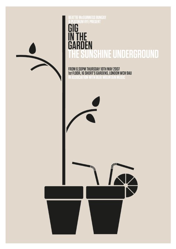
Been doing bits and bobs of graphic work during my time here so far. I've particularly enjoyed my task of yesterday and today to re-imagine a selection of posters for the agencies "Gig in the Garden" (inviting singers/bands to play to the employees). I chose to focus on the combination of musical elements with being in the garden in the hope that it would provide interesting visuals. I think it did, my favourites probably being the watering can sheet music and the hose-microphone.

Tuesday, 26 July 2011

v-v-v-vector face.

0 comments
So, I made this iPad on illustrator. Chuffed with the results.
Should prove a great way to frame work in a more engaging manner. Might try an iPhone next to join it.

The design displayed is my submission to the 'Design Against Fur' competition. Still waiting on the results of that, I hope something comes of it but don't want to get my hopes up. It's a departure from their typical pickings, so I guess it's make or break. If not, myself and course-mate Sam have plans to collaborate, taking the design into apparel and creating a campaign. The idea being to promote faux fur as an alternative in a more fashion editorial approach than crude guilt tripping, which although gets the point across in a direct manner, can often be counter productive - similar to that of typical charity ads. Engage, not point fingers.

In other news; I finally got round to watching Mad Men. Swell.

Wednesday, 20 July 2011

diamond wedding anniversary invitation.

0 comments

Diamond wedding anniversary invitation design for my Grandparents.

I wanted to create something that contrasted with the overtly feminine, flowery visuals that typically frequent such events. I think the result successfully achieves both an appropriate and personal approach, whilst remaining a slick piece of graphic design that stands out.

Congratulations to the happy couple and happy clients.


Sunday, 17 July 2011

update.

0 comments
It's been a while.

I've been slacking with my self-directed bits and bobs. It's amazing how quickly you can fall into a procrastinating rut. I already feel rusty.

It's not been completely devoid of creativity lately though. I spent this week on work experience/placement/whatever the kids are calling it these days, in Edinburgh at Hamlin Daniels, a brand communications consultancy. I've really enjoyed my time there. The team are friendly, helpful and more than willing to engage in discussions of the industry and beyond. I was given a live brief to contribute to a health food company rebranding and event promotion, which allowed me to tag along to meet the client and witness the early stages of planning. I've been asked back this week to finish my contribution as they'd like to use it, which is exciting.

Beyond that, my next excursion into the grown up world is at the end of August, where I've secured a few weeks experience at BMB in London. The large scale agency will offer a contrasting insight into the industry, which I'm looking forward to. In September, I have another few weeks organised to spend with Whitespace in Edinburgh...who's forte in digital media will provide even further insight. Pretty chuffed all round with the placements, hopefully a couple more in 2012 will allow me to graduate with a solid foundation of experience to move forward with.

Speaking of which, I'm only a bloody year away from graduating! This is nerve-wracking to say the least already. I feel there's so much more to learn and so much I want to cram in to the coming months both academically and socially to make the most of it. The year of the 'last ever's, not to mention the official end to the bubble of youth. That's before you even factor in the inevitable stress of the degree work and subsequent show. Massive question mark hovering over what that will entail.

I had hoped visiting the degree shows (ECA, DJCAD, RGU) would spark some inspiration, but really it only ignited worry. Perhaps that's a necessary evil. I wouldn't say I was blown away by any of them, but then again I'm not sure it's fair to expect that. In the cynical mind of an art/design student, anything that stands out is usually met with eye-rolls in regard to the pretension associated with it or work-envy. I think being in this frame of mind makes you overly analytical of the what/why/when/where/how, making it increasingly difficult to simply enjoy as a casual spectator. What I did take from it though is; when you've seen one graphic design degree show, you've seen them all. The concepts usually stay the same, but the quality differs. Gray's certainly benefited from having a more open Visual Communication course.

I hope that I will produce something that stands out, something that warrants more than a fleeting glance. Easier said than done. Especially if you're simultaneously hoping to appeal commercially. Alas.

So that's what's been going on in my head recently. With a heavy filtration system in place of course, or we'd be here all night. In other news; Harry Potter. End of an era.

Wednesday, 29 June 2011

true blood posters.

0 comments
Research for the next in my minimal film poster series (for 'Interview With a Vampire') reminded me of the True Blood offerings over the years. Although they have recently favoured more traditional (and unimaginative) promotional posters, they have had some gems. Here are my favourites:


Monday, 13 June 2011

minimal movie posters.

0 comments
Perhaps a cliche, but by no means less enjoyable ongoing self-directed summer project to visualise some of my favourite films in poster form. I'd quite like them to keep a degree of consistency throughout to form a 'set' of sorts.

Inspired by how the character of Derek Zoolander bears shame for not being able to turn left on the runway.


Visualising Juno's pregnancy, but also representing her romantic interest and father of the child through his love of orange Tic Tacs.

Sunday, 3 April 2011

james and the giant peach cover options.

2 comments
1)


2)


3)

Not finished concepts, just mocking up possibilities, a bit stuck on which direction to go down because all work well.

My gut feeling is to go with number 3. I like the homage to the subdued orange palette of the original Penguin book cover art. Perhaps too subtle for a children's book?

Tuesday, 29 March 2011

river thames competition 2011 entries (aoi/transport for london).

1 comments

"Wet and Dry Gin"


"Liquid Lunch"

Visualising that the River Thames as not only a route of transport throughout London, but also provides a desirable location from which to enjoy a scenic and social occasion. This piece embodies the urban and multicultural lifestyle available within the city.


"Thames Cornucopia"

Translating the urban interaction of people and public transport within the city centre of London. The boroughs form the jigsaw pieces which collaged together visualises the hustle and bustle of city life.

NOTE: The boiler (previously famed for destroying my 'Art of Nurture' art work) decided to give up again today, this time not only flooding but also shaking uncontrollably...which put me even more behind schedule and uncomfortably close to the deadline. How close? I submitted my third entry at 4:59pm of a 5pm close. Ridiculous.